Customize the checkout button
Style the embedded button so it fits your site while still making the checkout action obvious.
The checkout button is usually the only piece of Zwely your visitors see before the modal opens. It should feel like it belongs on your page, but it should also be easy to notice and easy to understand.
A simple, direct button almost always works better than a clever one. Think “Buy now,” “Download free,” or “Get the pack.”
Before you start
- Open the product you want to embed.
- Know the call-to-action text you want on your site.
Make the button feel at home
-
01
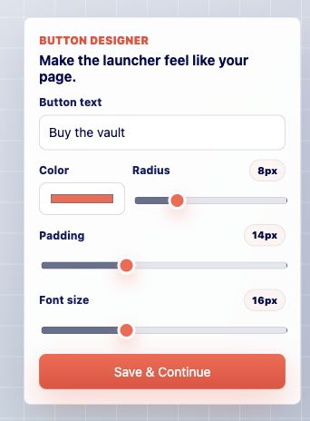
Adjust the button controls
Set the label, color, radius, padding, and sizing. Use a color that works with your page but still has enough contrast to look clickable.
-
02
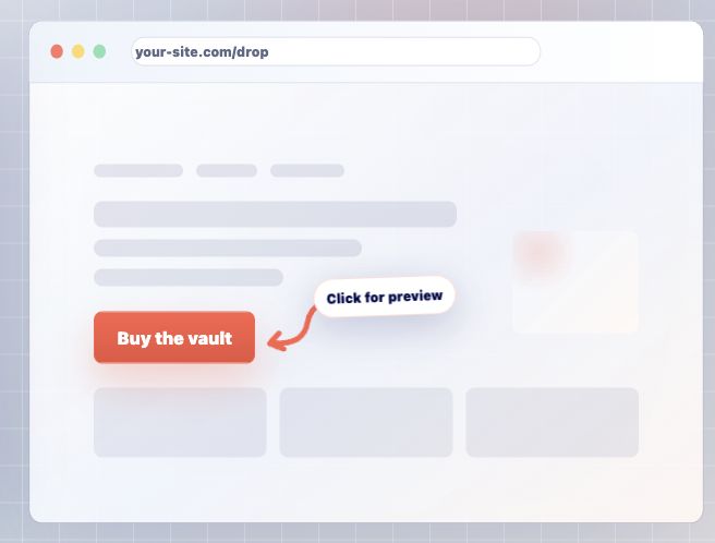
Check the live preview
The preview shows the button before you paste it on your site. Make sure the label fits, the button feels balanced, and nothing looks cramped.
-
03
Keep the button focused
The button should feel like the next natural step for the visitor. If it disappears into the page, make it stronger. If it feels too loud, soften the color or radius.
Good to know
- Button styling is product-specific, so each product can have a CTA that matches its page.